How to style your Instagram grid layout: 4 planning tools
Summarize this article via
Aesthetic Instagram feed requires meticulous media planning. Instagram grid is a unique way to make an impression and communicate your brand aesthetic to potential followers. A checkerboard effect, row by row layouts, and more — there are a lot of creative ways to play with the Instagram grid. In this article, we share visually attractive profile grid types and helpful tools to plan your feed.
Why create Instagram grids
Instagram is an extremely visual platform on social media. As a brand, it’s important to have a clear vision for your visual content. Using a unique Instagram grid layout can upgrade your social media presence to new levels.
An appealing Instagram grid allows you not only to visually connect your brand to your customers but to convert a larger amount of profile visitors into followers. Users arriving on your feed and seeing an impressive layout will be most likely to follow you. So, your Instagram feed can be a deciding factor for a user to click “follow”.
But keep in mind, that your Instagram post should be just as strong as your overall look and aesthetic. The quality of your grid and the quality of your individual content should go hand in hand.
Types of Instagram grids
If you struggle to decide what you want your Instagram grid to look like, here are some ways to organize your grid in creative layouts.
Squares
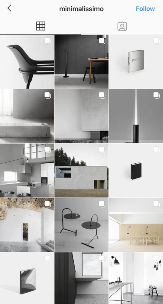
Square grid layout is generally the easiest one. The most important thing here is to choose your feed’s core colors and filters. Other than that, you can post one square at a time and not worry too much about how the images piece together.
For example, Minimalissimo (@minimalissimo) — a print and digital magazine dedicated to minimalism in design — posts photos that have a minimalist black and white aesthetic. Through a consistent visual theme, they aim to inspire other creatives to adopt a simple and minimal aesthetic.
Rows
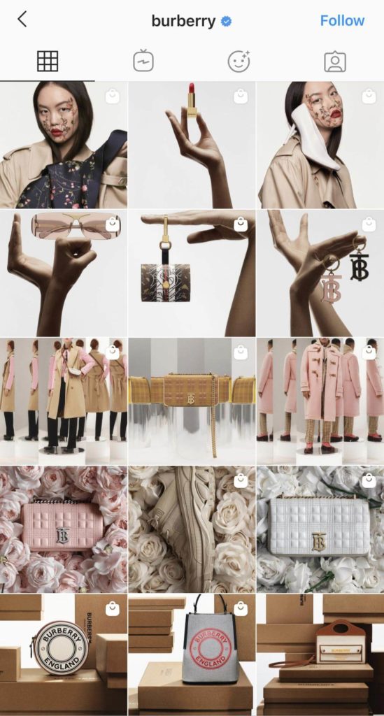
A grid using rows consists of three posts of related images. The photos per row must be related to each other in terms of color or visual aesthetic. But it doesn’t mean you need to feature the same thing per photo, ideally, each row should have the same visual aesthetic. This creates a very appealing look as someone scrolls through your profile. But make sure to upload three images at once, so the order per row isn’t ruined.
Burberry (@burberry) implements this Instagram grid layout. In one row, there are photos with the same visual theme. So, it feels as if you’re browsing through a magazine or a catalog.
Columns
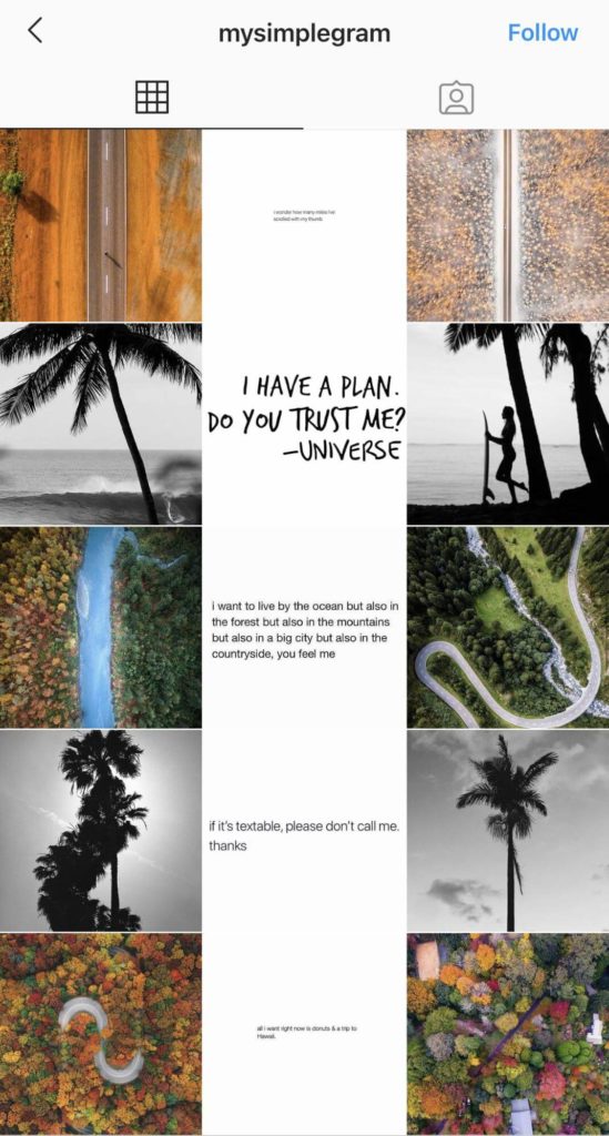
Columns are similar to rows: the layout requires three images to create the vertical effect. This gives the appearance of columns that stretch down the length of your profile. You can also make sure that the photos in each row are related to each other, to make your message more apparent.
For example, @mysimplegram account has photos of nature on the left and right rows, which complement or are related to each other. The middle of the feed features images of quotes on a white background.
Checkerboard Feed
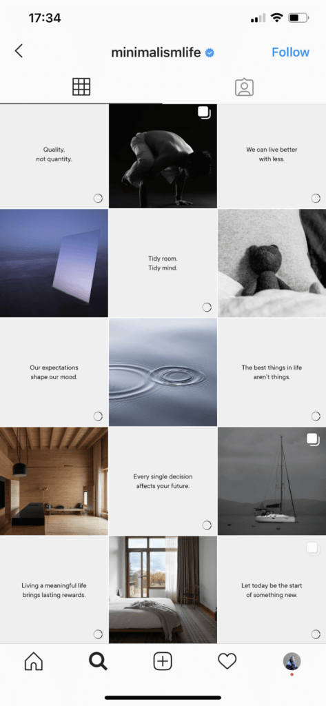
The checkerboard grid alternates between two post types or two colors. Most Instagram profiles use this grid by posting a photo, then a quote, followed by a photo and another quote. This is ideal if you’re a brand or an IG influencer who wants to send inspiring messages to your audience through text and visuals. It’s also super easy to do.
Here’s an example of the checkerboard feed from @minimalismlife:
Puzzle
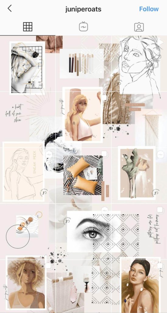
A puzzle grid is perhaps the most difficult layout to execute and maintain. Each post needs to be able to stand out in its own way while also fitting into the one larger picture. This needs to be planned in advance and sliced accordingly. You will need not only creativity but also some skills in graphic designing.
Here in the profile of @juniperoats, each post links to the posts surrounding it, creating this awesome puzzle grid layout.
Related article: How to create custom Instagram AR Filters for your brand?
Instagram grid tools
There are a lot of helpful tools (including Creator Studio by Facebook) to facilitate the planning of the Instagram feed in order to know which photos to post and when to post them to stick to your grid layout. Thanks to these tools, you can create an attractive and logical visual structure for your account. Use one of the following tools to plan your visuals ahead of time.
UNUM

UNUM is a popular grid planner tool that makes it easy to keep Instagram in one style. With the help of Unum, you can create and edit content, as well as analyze posting performance. When you connect and authorize a profile, you can immediately see Instagram statistics in it. The built-in photo editor will help you edit photos. It has no restrictions on the number of connected accounts, and you can manage all profiles from one application. To keep and follow the content plan easily, you can set reminders in a special calendar.
Platform: iOS, Android.
Multi-account: Yes.
Cost: Free, but there is a subscription for $ 4.99/month with more advanced functions.
Preview
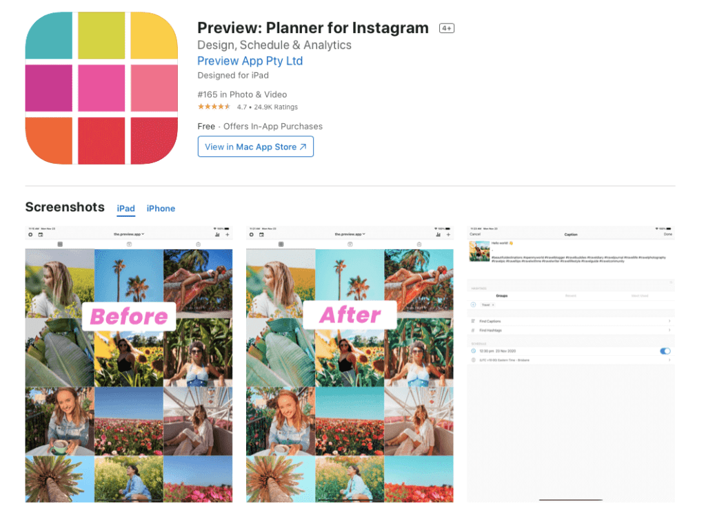
Preview is a comprehensive solution for maintaining Instagram in a uniform style. The application has in-depth analytics of the page and social media competitors‘ profiles, a hashtag manager, a convenient feed planner, as well as many filters, frames, tools for working with text, and the ability to save the result template.
Platform: iOS, Android.
Multi-account: Yes (only with a premium subscription).
Cost: Free, but you can expand the functionality by subscribing: Pro – $ 6.67/month and Premium – $ 12.50/month.
Planoly
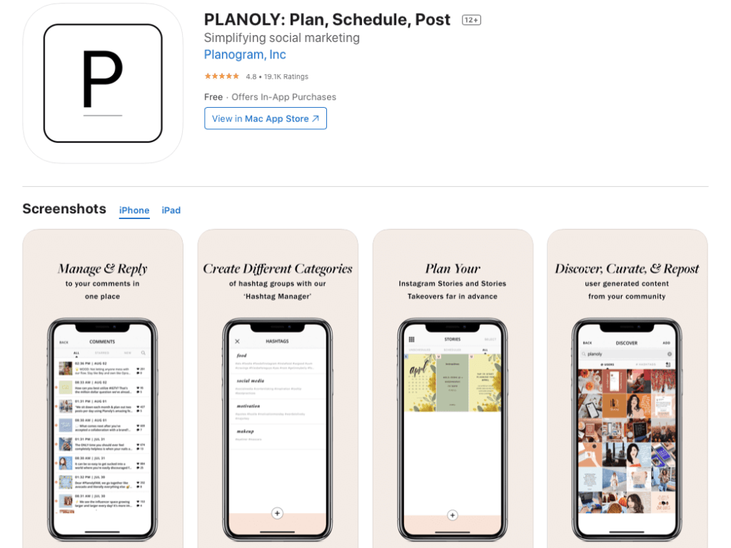
Planoly is the official panther of Instagram and the best solution for commercial accounts. With the help of Planoly, you can create draft posts and plan a grid of posts. In addition to scheduling feed publications, you can add a plan for Stories. You can communicate with your team members in the app, upload photos from Google Drive and Dropbox, create collections of hashtags, and more. The application is free to use, but the standard functionality is limited. Expanding capabilities and maintaining multiple accounts is possible only by subscription.
Platform: iOS, Android.
Multi-account: By subscription only.
Cost: Free. Subscription options start from $ 7 per month.
Plann
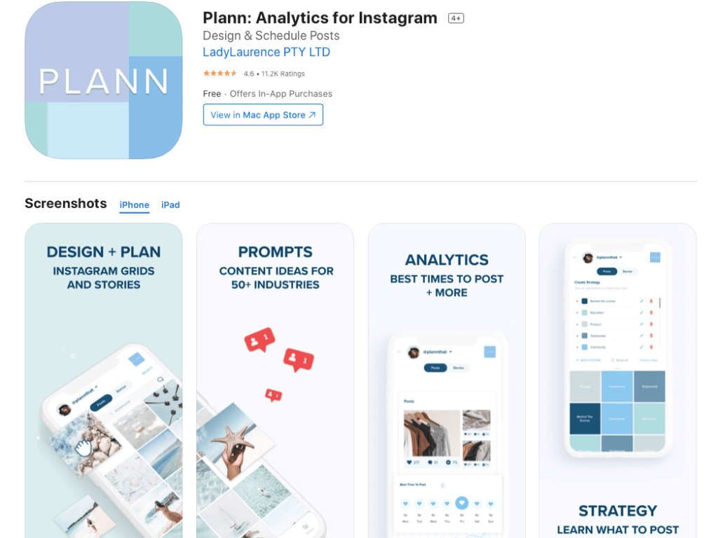
Plann works on all smartphones and systems, and also opens through browsers on a PC. There is a built-in photo editor that will save you time. You can edit photos, access Canva, visually plan your feed and Stories, choose the best time to publish posts and top hashtags based on the analytics of your account and also competitors’ profiles.
Platform: iOS, Android.
Multi-account: By subscription only.
Cost: Free. Subscription options start from $ 7 per month.
Aesthetic Instagram grid examples
Check these accounts out and get some inspiration for your own Instagram grid.
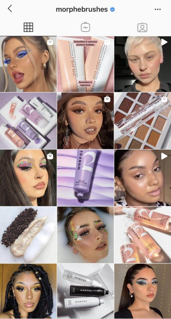
@morphebrushes cosmetics brand uses a checkerboard effect by posting a photo of a makeup product followed by a photo of a makeup artist/customer.
The same checkerboard effect is used by @thefemalehustlers, which provides empowerment, motivation, and support for all the women who want to make a change.
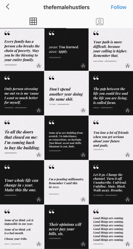
Can you see two totally different approaches to achieve the same checkerboard grid layout? You only need to find the right perspective and generate new ideas.
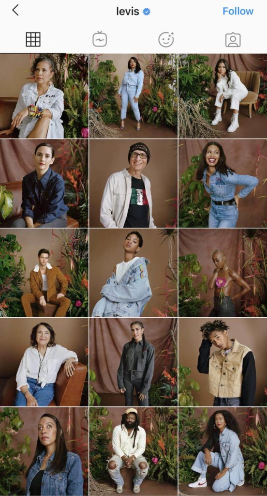
@levis brand of denim jeans uses square grid and core colors to maintain the stylish look of the profile feed.
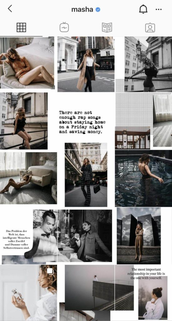
Berlin-based blogger @masha uses a puzzle grid to create visual interest.
To sum up,
It’s great to have a consistent looking grid and to get creative with grid styles. Using the tools described above will help with planning the aesthetic Instagram grid layout. Trends are constantly fading into the past, new ones come in their place. So, don’t be afraid to experiment, change and try something new.


