8 fun ways to make Instagram aesthetic for 2024
Summarize this article via
As the saying goes, a picture paints a thousand words. And that’s certainly the case for Instagram. From your color palette to the layout to your tone of voice, your Instagram aesthetic is the first thing people notice when they land on your account. As such, it could mean the difference between gaining new followers and losing potential customers.
With almost half of Instagram users shopping on the platform weekly, it makes sense to cultivate an inviting Insta page. Think of it like a brick-and-mortar store; the way you dress will either lure customers in or drive them away.
As a business, your Instagram aesthetic should be unique, consistent with your brand, and in line with your values. Ideally, followers should immediately be able to recognize your content when it pops up on their feed.
Creating the perfect Instagram aesthetic for your brand is no mean feat. That’s why we’ve put together this guide to inspire you to build a standout Instagram aesthetic in 2024.
Why your Instagram aesthetic is so important?
Having an eye-catching Instagram aesthetic is more than just making your account look good. With an increasing number of businesses relying on social media to grow their business, your Instagram aesthetic plays a pivotal role in gaining a following. In fact, as social media becomes the marketing tool du jour, your Instagram page is now just as important as your website.
With so much potential to build brand awareness and connect to new audiences, an aesthetic Instagram shows viewers who you are right off the bat.
A quick way to test this out is to put yourself in the shoes of a viewer who has no idea who your brand is. Go to your Instagram page and ask yourself if the viewer could easily answer these questions:
- Who are we as a brand?
- What do we do, and how do we do it?
- What are we known for?
- What type of service can they expect from us?
If viewers can answer these questions after a quick scroll through your account, your Instagram aesthetic is on the right track.
In short, your Instagram aesthetic matters because it shows who your brand is and what you do. This, in turn, is the best way to grow your account and gain more customers.
How to make your Instagram aesthetic
We’ve seen why creating an aesthetic Instagram is so important. Now, let’s look at how to achieve it.
Customers will form an impression of your Insta account in ninety seconds or less. Therefore, you need to make an impression right away. Let’s face it, if your Instagram page is messy and disjointed, potential customers will assume your service is too. That’s where an appealing Instagram theme comes in.
For the unfamiliar, an Instagram theme is the overall visual aesthetic of your Instagram page. It ties all your content together for a cohesive feel that tells a story. For instance, a travel brand may want to go for tropical colors and aesthetic pictures from far-off destinations, while a sustainable clothing brand may opt for earthy tones and green shades.
Building a unique Instagram is more than just posting aesthetic pictures. It requires planning, tweaking, and clear brand identity. Here are seven tips to elevate your Instagram theme for 2024.
1. Get clear on your goals
First things first, you need to nail down the goal of your Instagram aesthetic. How do you want users to feel when they click on your page? What makes your brand different from the rest of the competition? What type of content can viewers expect to see from your account?
Setting clear goals will not only keep your Insta looking consistent, but it will also make the content creation process a lot smoother.
The good news is that you have probably already established a lot of these factors. If you have a style guide for your business and website, this will be the foundation for your Instagram account. You will simply have to translate your brand aesthetic and identity in a way that resonates with an Instagram audience.
Here are some considerations to keep in mind when setting goals for your Instagram aesthetic:
- Who is your target audience, and what aesthetic are they drawn to?
- What are your core brand values, and how can your content reflect these?
- How does your brand want to come across, and does your content fit with the vibe?
At this stage, it all boils down to establishing who you are and who you want to connect with. Once you define this, it’s time to move on to the look and feel of your page.
2. Choose a consistent color palette
The color palette is one of the biggest elements of an Instagram theme. Whether you opt for your brand colors or a minimal color palette that reflects your Instagram vibe, choose carefully. Color has a huge impact on consumers’ buying decisions. In fact, research shows color increases their chances of reading your product description by 80%.
Once you have chosen your color palette, this will form the base shades of your content. That’s not to say that everything has to be one color. Your color family should give you enough options to play around with while remaining cohesive. Ideally, your color palette will be made up of six colors.
We’re huge fans of the @fentyskin aesthetic. The beauty brand embraces a neutral color palette of browns and creams for a clean, luxurious, and totally iconic look.

If you don’t fancy locking yourself into a specific color palette, color transitions are a great alternative. This involves color blocking and having colors blend into another color with each photo. It’s a fantastic option for brands who want to post content in a wide range of colors but still crave a cohesive finish.
Not sure where to begin? Tools such as My Insta Palette, Coolers, or Canva are a great help. They highlight the common colors used on your page, helping you to choose a theme.
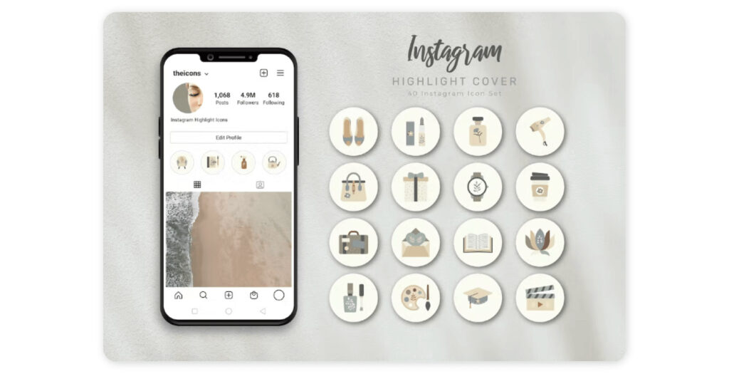
Don’t forget to settle on an Instagram icon aesthetic. If your brand plans to add highlights to your page, then you’ll need to come up with some aesthetic icons to use as highlight covers. These will add loads of visual appeal to your page and should match your overall theme.
For example, these gorgeous, minimalist icons from Envato are perfect for travel brands.
✨ Bonus: The eight best aesthetic Instagram highlight ideas to try
3. Choose an editing style
Consistency really is key when it comes to creating an Instagram theme. Aside from sticking to your color palette, you should also consider how you edit your content and the filters you use. Using different filters will be jarring for users, so find one or two that you love and stick to those. You can choose from Instagram’s in-built filters or opt for an editing app.
Of course, you don’t have to use filters at all. In fact, some of our favorite Instagram feeds skip the filters altogether and use clever editing to get that consistent, one-of-a-kind look.
Speaking of editing, it’s best to stick to one editing style. Instagram presets will help you achieve a cohesive finished look in a flash (no pun intended). For example, let’s say your content is mostly bright, cheerful pictures. Suddenly posting dark, black, and white content will confuse followers and make them look off-brand. Remember, you want users to instantly recognize your content when it pops up on their feed.
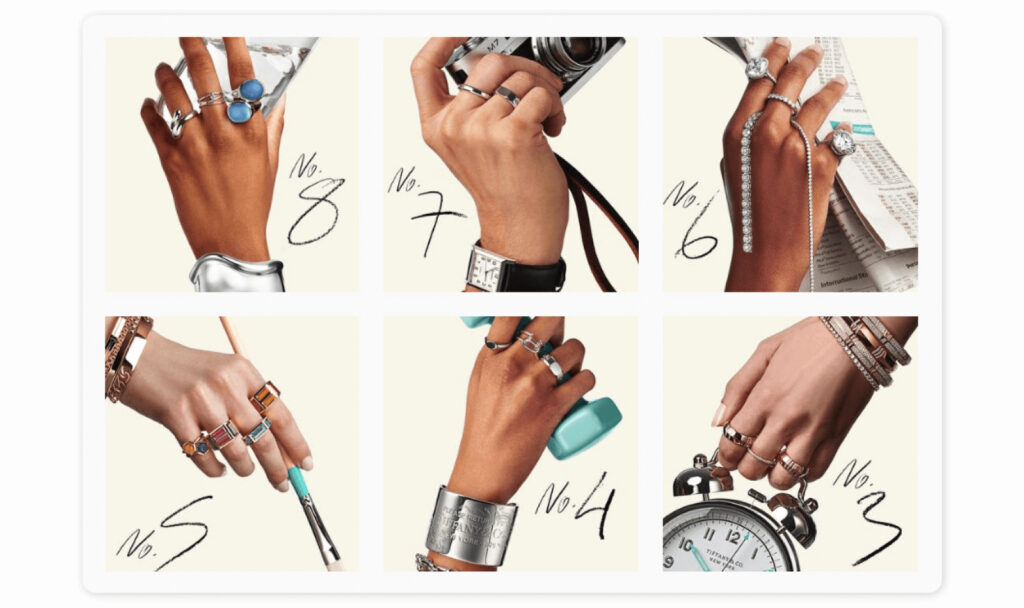
Jewelry icons @tiffanyandco created a stir with their New Year’s Resolutions campaign. The iconic brand created nine stunning images with a distinctive edit to promote the #Tiffanyresolutions campaign. Adding a splash of its trademark blue color, the images were showstopping (or should we say thumb-stopping).
4. Plan ahead
In the words of Boy Scouts everywhere, be prepared. Once you have defined your Instagram theme, don’t just start posting randomly. Instead, plan out your posts consistently and ensure every piece of content is aligned with your fresh new Instagram aesthetic.
Planning your posts in advance doesn’t just save time and ensure your content goes out regularly. It also gives you a birds-eye view of how your Instagram grid will look. That way, you can make sure everything fits together properly. For instance, you may notice that several posts in a row are too similar and lack variety. Or, perhaps you need to add a pop of your primary color to one of your posts.
Think of your Instagram grid as a puzzle, planning ahead allows you to place all the pieces in the right place at the right time.
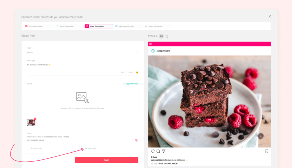
Social media management tools are a lifesaver for planning, scheduling, and analyzing your social media content. As a result, your team can spend less time on manual tasks and more time on creating compelling content.
5. Define an aesthetic for Instagram Stories
There are over five hundred million active stories on Instagram every day. If this staggering figure tells us anything, it’s that Instagram Stories are set to stay trending in 2024. And it’s no wonder. Branded Instagram Stories are a powerful tool to connect with Instagram audiences through industry-related content, product demos, and customer reviews.
Don’t forget to apply your Instagram theme to your Stories, too, for a truly cohesive feel. Similar to your Instagram feed, your Stories should be consistent in terms of filters, format, and edits.
You’ll also want to stick to the same Instagram story dimensions. For instance, the dimensions are usually 1080 pixels wide by 1920 pixels tall (1080 x 1920, or 1080p resolution) when you shoot an Instagram Story with your phone. These match the recommended Instagram Dimensions, meaning you won’t have to resize anything.
🥁 Bonus: Up-to-date social media image sizes in 2024 + Free Cheat Sheet
However, if you plan to shoot your Stories on a different camera, you will need to use a video editing app to ensure your Stories fit Instagram Story Dimensions. While it may add an extra step to the content creation process, it’s paramount for optimizing the user experience and user engagement on your Stories.
According to Instagram, your Stories must:
- Be 1080 pixels wide by 1920 pixels tall (1080 x 1920, or 1080p resolution)
- Have an aspect ratio of 9:16
- Have a minimum width of 500 pixels
- Be a maximum of 15 seconds
- Be an MP4, MOV, or GIF video file
Following Instagram Story dimensions are important for a number of reasons. Firstly, it ensures your content is of the best quality possible, making your brand look more professional. What’s more, it reduces the risk of having your videos or images cut off. This looks sloppy and can negatively impact your Instagram engagement rate.
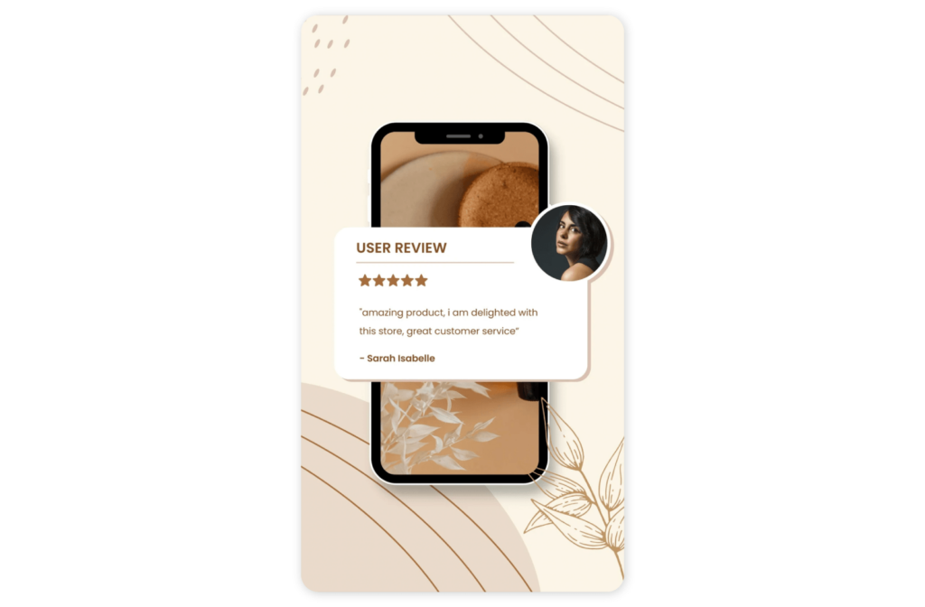
Instagram Stories templates are an easy way to create a cohesive Instagram aesthetic for Stories as well as your Grid. You can buy packs of templates and use apps such as Adobe Photoshop to tailor them to your Instagram theme.
This user review Story template from Canva is a sleek choice for brands who want to spotlight their customers’ rave reviews of their products.
6. Use the right tools
There’s no way around it, nailing down your Instagram aesthetic takes time. That said, there are plenty of tools to help you maintain it with little to no effort. We recommend investing in the following tools to keep your Instagram theme consistent and impactful.
- Video editing tool – To edit, resize, and customize templates for your page
- Social media management tool – To curate, approve, publish, and easily view social media analytics, including Instagram analytics
With these two tools, you will have everything you need to create and maintain an aesthetic Instagram in 2024.
Sociality.io enables your business to monitor the success of your Instagram aesthetic. The in-depth analytics offer you insight into how your audience is engaging with the content. In turn, you can use the data to understand what aesthetic your audiences love and tweak your content plan accordingly.
If you have a business or creator account, you will also have access to Instagram insights. This is a free service that gives you an overview of key metrics such as organic and boosted content. Our guide breaks down how to view insights on Instagram.
7. Think ahead
A final word of advice.
As tempting as it may be to go for a bold Instagram theme, always think ahead. Choosing a super bright or distinctive theme could end up hindering you down the line. When in doubt, stick to a simple theme that won’t feel outdated or restrictive as your brand grows.
8 Iconic Instagram aesthetics we love
Keep reading to discover eight of our favorite Instagram themes that are bound to get your creative juices flowing.
1. Pop of pastel
@HMbeauty shows us that pastels aren’t just for Easter. The beauty brand seamlessly blends pastel colors to create a bold, summery aesthetic that showcases its beauty collection perfectly.
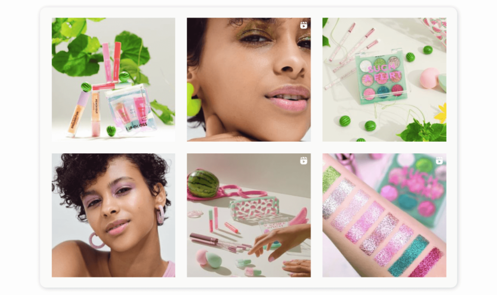
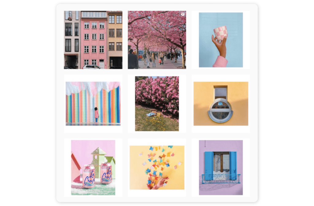
And we can see where H&M Beauty got its inspiration. The global creative director of H&M beauty @creativekipi is clearly a fan of a pastel color palette. Her Instagram page shows us just how impactful a pastel theme can be. Her Instagram grid is full of joyful images with her signature pastel color palette. You know the moment you land on her page that her content is going to be uplifting, playful, and never dull. She also combines vertical and horizontal borders for a touch of whimsy.
2. Get adventurous with camera angles
Camera company @gopro has long made a name for itself as an adventurous brand, and its Instagram page is no exception. Go Pro’s Instagram feed is packed with dynamic, adventure photography that plays with angles for a distinctive and exhilarating result. Eye-catching and instantly recognizable, the Go Pro aesthetic uses interesting camera angles and a cohesive editing style to tie its images together without sticking to a specific color palette.

3. Use words to draw in your audience
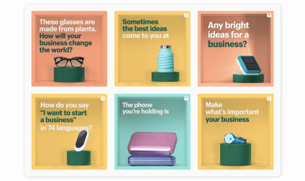
E-commerce platform @shopify proves that a brand doesn’t need to spend a fortune on professional photographers and editors to create an engaging Instagram account. With over a million followers, Shopify fills users’ feeds with attention-grabbing quotes and images in a blend of colors. Their content is focused on personal customer stories, sparking conversations, and posting lifehacks. To keep its page cohesive and attractive, it sticks to a professional and consistent style that its audience loves.
4. Rainbow explosion
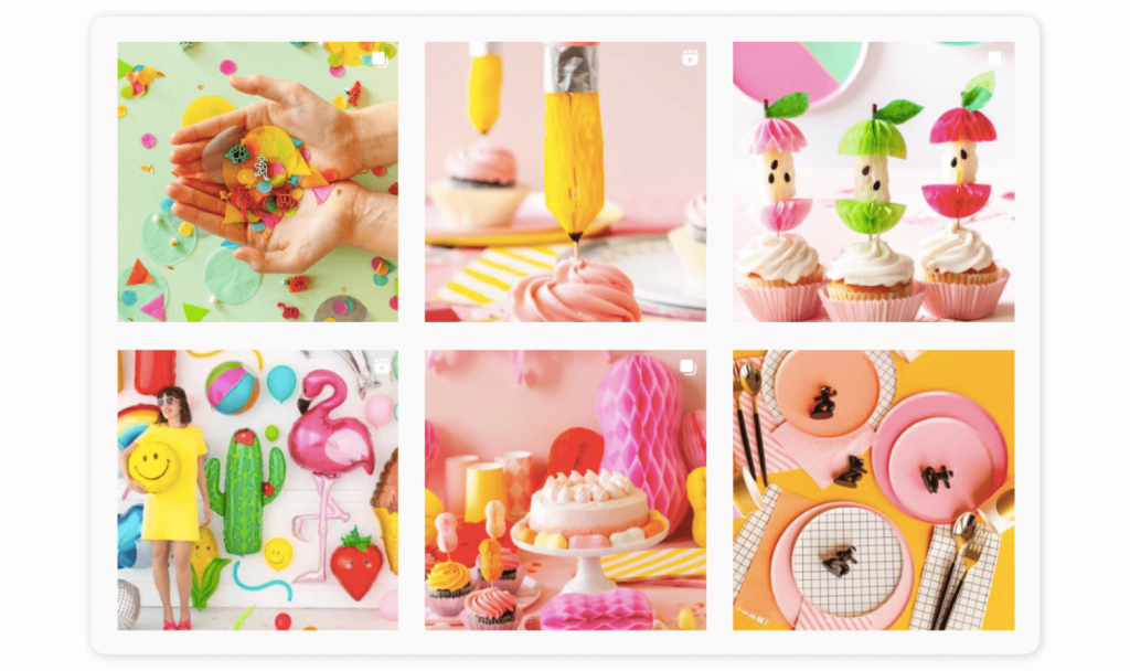
Who doesn’t love a pop of color? Radiate joy from your Instagram page by using all the colors in the rainbow like @ohhappydaypartyshop. The party supplies brand plays around with bold, bright colors while tying its content together by always featuring its beautiful party supplies. It’s whimsical, nostalgic, and full of fun.
Fast-food chain @McDonalds is another brand that isn’t afraid to use color. Its Instagram grid is packed with bright colors and a vibrant mix of content. That said, it always comes back to the signature brand colors of yellow and red to tie everything together.

5. Signature pose
Repeating a similar pose or composition on your Instagram grid may seem a little repetitive, but @starbucks shows us how to do it right. The coffee giant cleverly uses a signature pose to showcase its latest drink. The pose may be similar, but the drink and background are always different, making the page dynamic and one-of-a-kind.
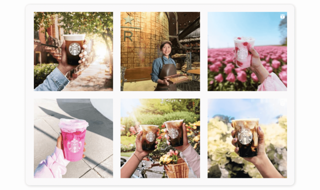
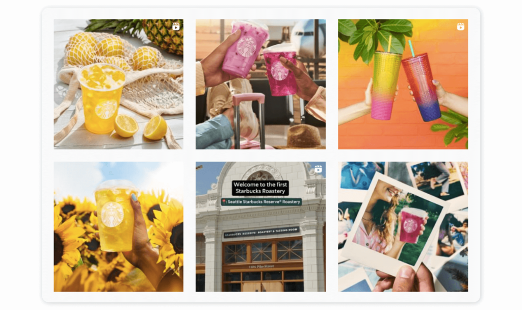
That’s not the only lesson we can learn from Starbucks. Rather than sticking to a single color palette, Starbucks adapts to the seasons. From cozy autumn colors and hot pumpkin spiced drinks to tropical summer brights with fruity iced beverages, Starbucks matches its aesthetic to the weather. The signature pose showcasing the Starbucks logo ensures users always know exactly whose content they are viewing.
6. Play with borders and frames
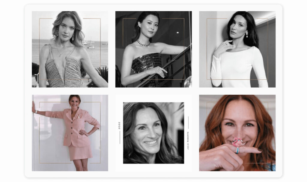
Ok, this one is for the truly dedicated social media teams out there. Playing with vertical and horizontal borders is a creative way to make your brand’s page stand out from the crowd.
Luxury jewelry brand @Chopard uses borders to create a clean, minimalist look with a twist. Chopard plays with dimensions by using frames and white borders on some images, giving a polaroid snapshot effect. The result is a unique and visually appealing finish that draws you in and accentuates the images. For a bolder look, you could play with black or color borders.
7. Vintage touch
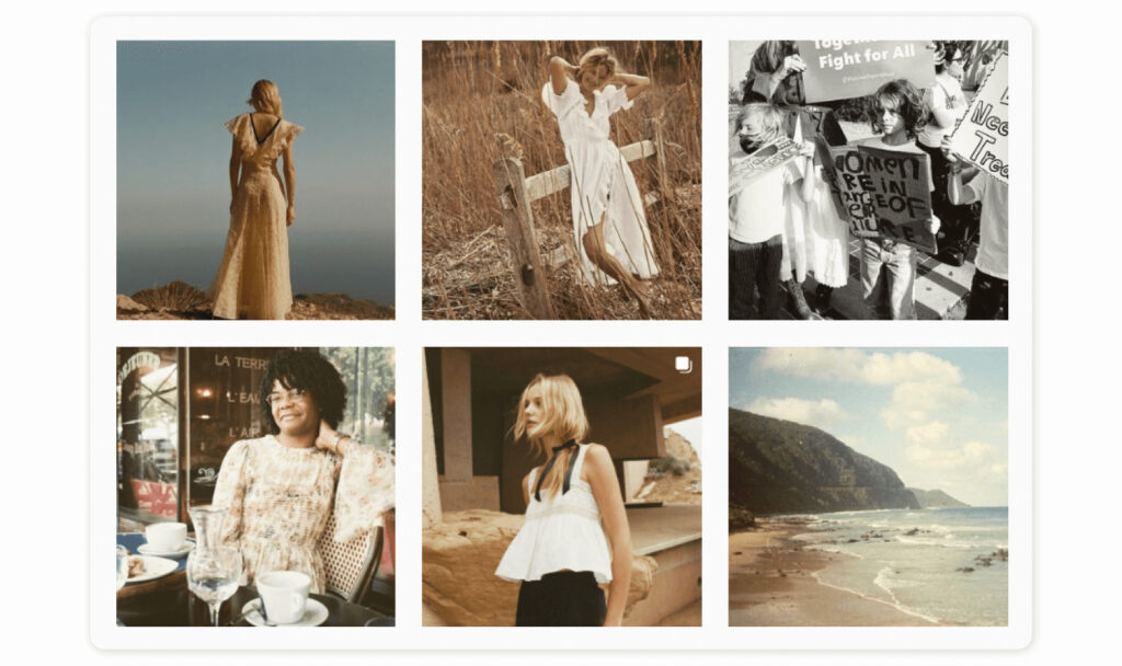
The seventies never stays out of fashion for too long, and it’s back again in 2024. Instagrammers can’t get enough of the dreamy, vintage aesthetic. Take fashion brand @shopdoen. They give their Instagram an ethereal, wistful vibe with their perfectly curated photos and vintage filter. It perfectly showcases their clothing and gives the nod to the nostalgia of the seventies.
8. Grainy and gritty
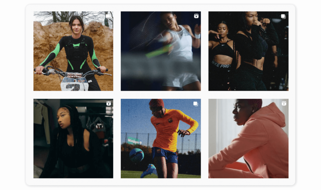
Sportswear giants @nike translate the grit of their athletes on their Instagram with a grainy, gritty filter. Nike’s Instagram page is one-of-a-kind, using dynamic images with a raw finish to embody its mission to get everybody moving (while also promoting its products and the athletes it collaborates with). Thanks to this dark and unedited style, users immediately know when Nike content pops up on their feed and can’t help but stop scrolling.
Final thoughts
We hope we’ve left you feeling inspired and ready to give your Instagram aesthetic a facelift in 2024. As a visual platform, how your Instagram page looks has a huge impact on your following and business growth. The best way to get customers to stop scrolling when they see your content is to be consistent, cohesive, and authentic. If you’re new to the game, there is a wide range of tools on the market to help you nail your Instagram theme and manage your social media content.


