LinkedIn carousel 101: What it is, how to create and best cases
Summarize this article via
In July 2022, LinkedIn launched its native carousel post format. But, despite initial excitement (and high click rates), the platform removed it less than a year later. The reason behind this sudden move was less than favorable feedback from LinkedIn creators.
If you were sorry to see LinkedIn carousel posts go, we have good news. You can still make carousels using the LinkedIn document post (also known as the PDF post hack). That way, you can continue enjoying the benefits of this content format.
Keep reading to discover all the juicy details about creating LinkedIn carousels, including best practices and examples.
First up: A carousel definition.
What is a LinkedIn carousel?
A Linkedin carousel is a content format that allows you to share multiple images or videos in a single post. Viewers can simply swipe through your carousels to see each image or video or wait for the carousel to switch next slide automatically.
Since this feature was removed in June 2023, LinkedIn creators have resorted to using PDFs to create the carousel effect. Here’s how that looks.
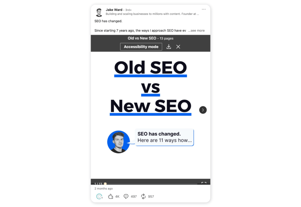
All in all, this is a pretty clever workaround. The only catch is that document carousels can’t include video files.
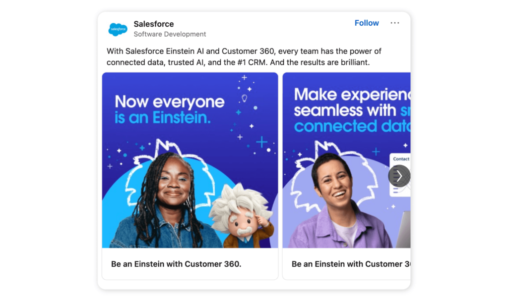
And good news for businesses that use LinkedIn carousel ads – this format is still going strong on the platform.
📚 Additional reading: 7 LinkedIn marketing tips for your business: 3 experts contribute
Why create a LinkedIn carousel post?
You may be wondering why you should bother creating a LinkedIn carousel post in the first place. Well, the simple answer is that these posts garner a lot more engagement.
As we’ve seen from other platforms, such as Instagram, users tend to interact more with image carousels. This is most likely because carousel posts are visually appealing, breaking content down into handy little snippets. After all, who wants to read an essay disguised as a LinkedIn post?
Another reason for the popularity of carousels is the content that they typically contain. If there’s one thing we know, it’s that LinkedIn users love data. And PDF carousels are an excellent way to present data visually. In other words, they give users what they want and wrap it in a pretty bow.
How to create a carousel post on LinkedIn?
If you’re new to the LinkedIn document post hack, then you’ll want to keep reading. Here’s a step-by-step guide on how to create a makeshift carousel post on LinkedIn.
- Step 1: Click “Create a post”
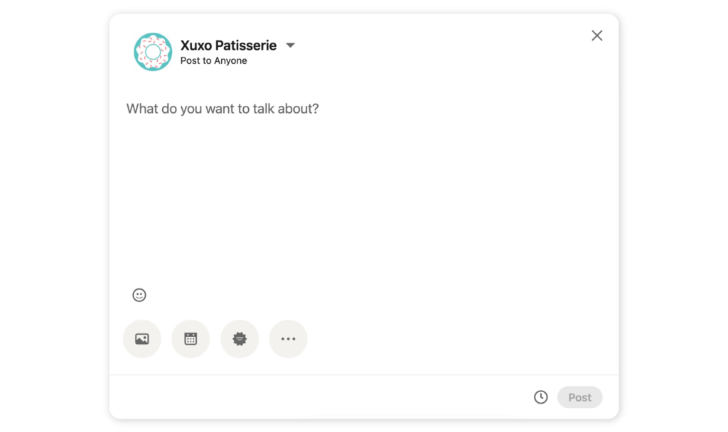
- Step 2: Type the main text for your post, then click the three dots icon
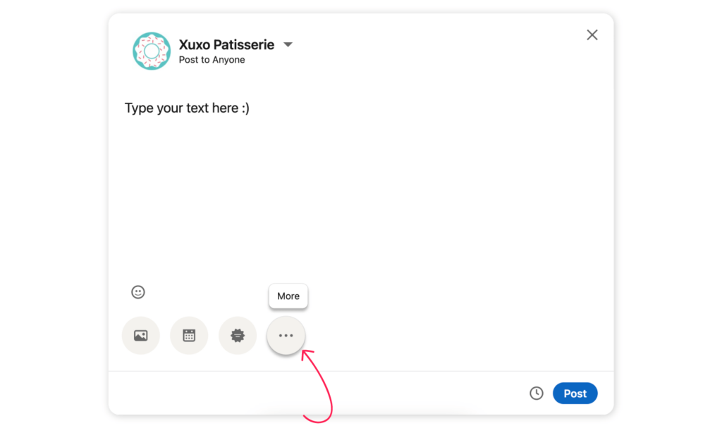
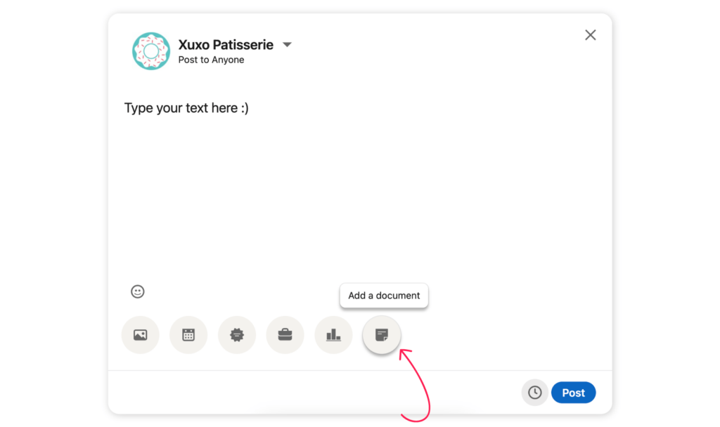
- Step 3: Click on the “Document” icon and attach your PDF/PowerPoint/.DOCX file
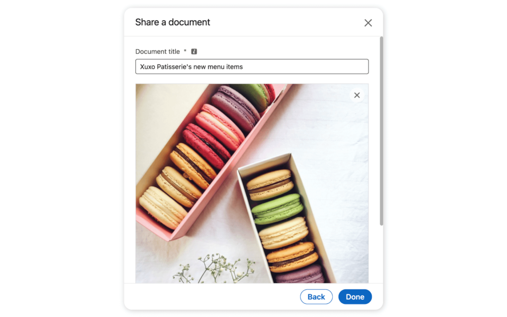
- Step 4: Give your document a title (this is visible to the public), and hit “Done”. Your carousel is now published!
💡 You can post a document carousel from the mobile app too. Simply hit “Post” > “More” > Attach document.
Format, size, and dimensions of a LinkedIn carousel
Getting the dimensions right is crucial. After all, you want viewers to be able to easily read and navigate your content offerings. Here are the specs to follow.
Document carousel post specs
Now that LinkedIn carousels are a thing of the past, you’ll need to use the following specs to create document carousel posts.
The document must be:
- A PDF, PowerPoint, or DOC/DOCX file
- Maximum of 300 pages
- Less than 100MB
- A4 size for optimal visibility
Carousel ad dimensions
Follow these specs for LinkedIn carousel ads.
- Use a JPG, PNG or GIF (static only) file format
- Utilize a 1:1 aspect ratio (square)
- Minimum image size of 1080 x 1080 pixels
- Each image should be less than 10 MB
- Add a minimum of two and a maximum of 10 images
🎉 Bonus content: Social media image sizes in 2024 + Free Cheat Sheet
How to make a good carousel post?
Nailing your LinkedIn carousel can do wonders for growing your following on the platform. And, with these foolproof hacks, it’s easier than you think.
Follow these handy tips to create engaging and high-converting carousel posts in just a few steps.
1. Grab attention
LinkedIn is a competitive platform, so you have to think outside the box if you want to stand out. Start by ensuring that your document is visually pleasing. Think bright colors, catchy headlines, and branding (these are downloadable, after all).
Spotify grabbed our attention when it used an eye-catching LinkedIn carousel post to spotlight one of the brand’s Machine Learning Engineers.

2. Educate viewers
Viewers (and future buyers) appreciate high-value content. That is, content that teaches them something new. This is particularly true on LinkedIn. So, use carousel posts to educate your followers. For example, share company data, industry stats, step-by-step tutorials, or other relevant know-how.
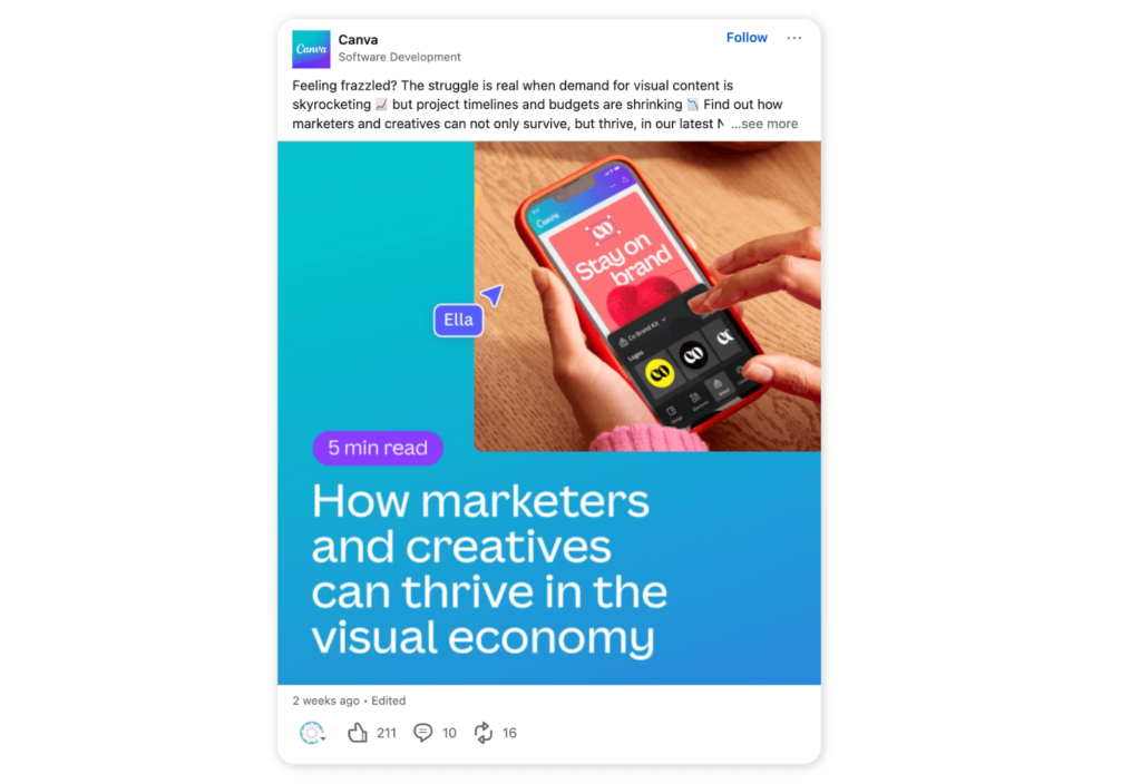
Carousels are the perfect tool for sharing this type of content in a visual way, breaking it down into readable snippets. Take this educational post from Canva, which gives actionable advice for marketers.
3. Tell a story
Carousel posts are an excellent way to tell a story, as viewers can simply swipe to the next part of the story or sequence. As such, they’re an ideal content format for sharing customer stories, your company history, and promoting job opportunities.
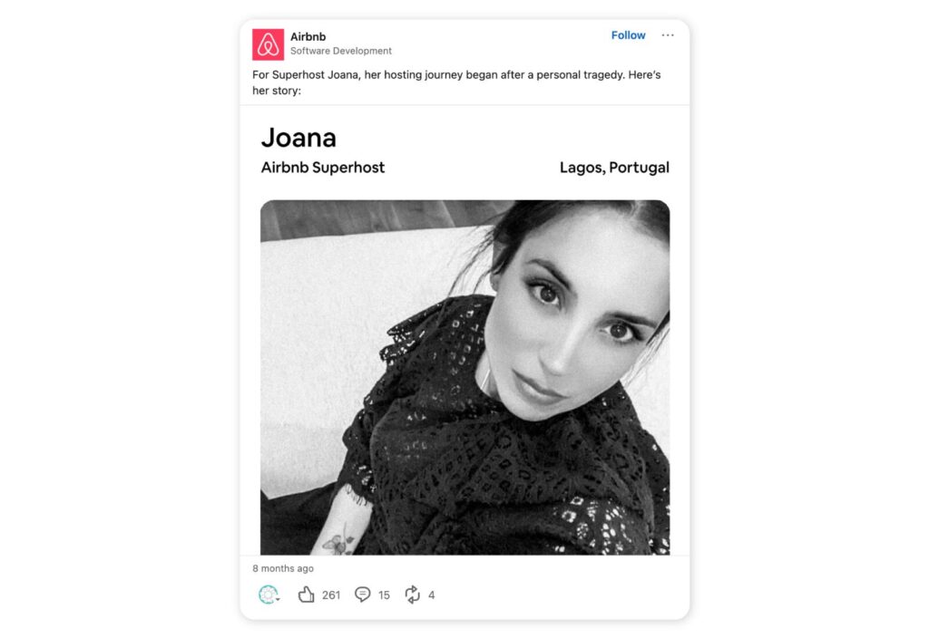
Airbnb is a master at storytelling, expertly showcasing the lives, struggles, and accomplishments of its customers.
4. Summarize an interview
Carousel posts offer a smart way to sum up the key messages in an interview or share important quotes.
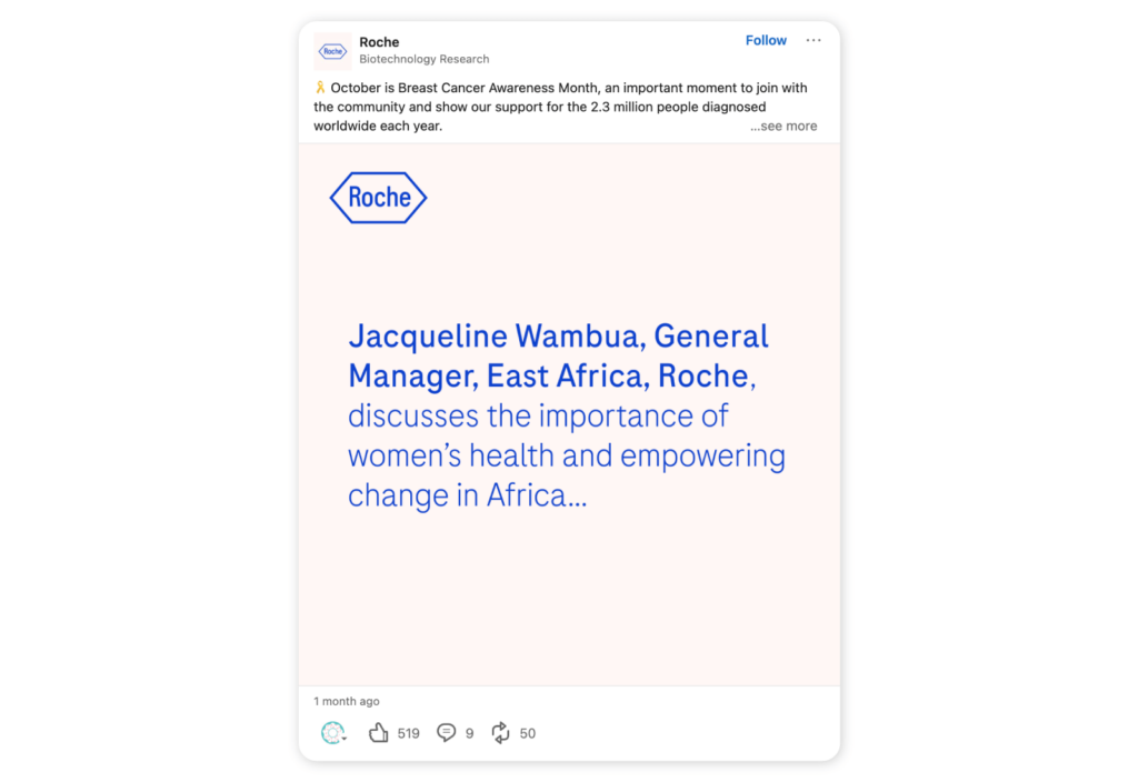
This post from biotech research company Roche is a prime example. Roche shares a brief message from its General Manager in East Africa about the importance of women’s health.
5. Promote events and national holidays
Got an upcoming industry event? Or perhaps your business is hosting a workshop or masterclass? Promote it with a LinkedIn carousel. This format is ideal because you can add the key information (what, when, where, and why) on the first few slides. Then, add any additional details further along the carousel.
Let’s face it, we’re all too lazy to read long posts these days. So, take a load off your followers and drip-feed them the critical information.
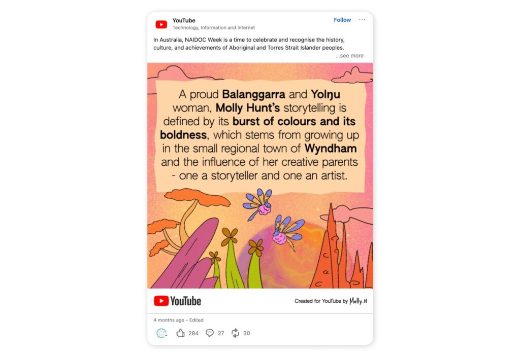
YouTube put the spotlight on NAIDOC Week in Australia with this beautifully curated carousel post.
6. Showcase a product
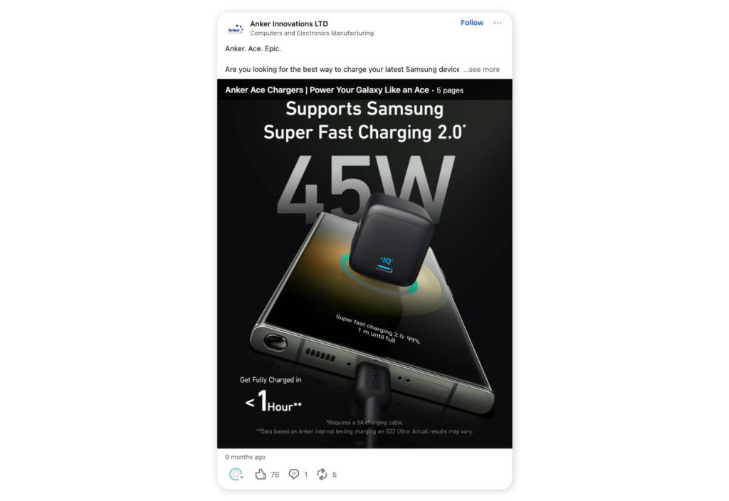
The beauty of carousels is that you can add multiple images of the same product for a 360-degree view. This works perfectly for promoting new products and letting your audience see it from every angle.
This carousel post by Anker Innovations expertly gives its audience a complete picture of its new product.
7. Show off your work
What business isn’t going to toot their own horn just a little on LinkedIn? Well, if you want to showcase your company’s latest projects or successes, then a carousel is the way to go. You can easily create a mini CV or portfolio that shows snippets of recent work your company has completed.
8. Give blog content a fresh look
Not getting much traffic when you share your company’s blog posts to LinkedIn? You’re not alone. Link shares are notoriously shaky when it comes to engagement.
But that’s not to say you should let great blog content go to waste. Document posts offer an exciting way to repurpose core information from blog posts and present it in a more engaging format.
It’s as simple as breaking down the key points and dividing them into separate slides.
⚡ Elevate your LinkedIn game: What is the best time to post on LinkedIn?
10 best practices of carousels on LinkedIn
Congratulations, you are now a fully-fledged carousel pro. But we do have a few more pearls of wisdom to share with you before you hit “Post”. For optimal results, follow these LinkedIn carousel best practices.
- Start strong: The best way to get viewers to swipe to the next slide is to kick off with a bang. Use powerful visuals to grab attention and set the tone.
- Quality over quantity: Choose a few high-quality images for your document posts. Usually, five or six is the sweet spot.
- Less is more: This is a gentle reminder that each image in your carousel should be easy to read. Too much text will overwhelm readers. This is not the place for fluff. Nor is it the place to share every piece of information on a topic. So, use an editing eye and stick to the key points.
- Get the specs right: Remember that your images should be between 1080x 1080 pixels with a 1:1 (square) aspect ratio.
- Put the link in the comments: It’s an uncommonly known fact that when you upload a PDF or doc to LinkedIn, anyone can download it. Since most people don’t know this, it’s a good idea to add the link to the relevant landing page so people can download the full document.
- No videos: LinkedIn document sharing doesn’t currently support videos, so make sure to omit these before you post.
- Think mobile: Most of us use the mobile app, so make sure you optimize your carousels for mobile view.
- Brand your slides: Get your brand identity out there and make your content consistent by using your brand color palette, font, and styling throughout each slide.
- Have a strong CTA: Since users can’t click on the CTA in the document itself, you’ll need to include it in the text of the post. Whether that’s to download a free template, hit the follow button, or visit your website, be clear.
- Use a social media management tool: LinkedIn automation tools can streamline the content process, leaving you more time to cook up your next carousel. For instance, Sociality.io puts scheduling, performance tracking, advanced analytics, and competitor benchmarking on autopilot. That way, you can monitor how your carousels perform.

FAQs
Discover answers to the most commonly asked quotations about LinkedIn carousels.
What is a carousel post?
A carousel post is a content format commonly used on social media. It allows creators to share multiple images or videos in one post. Viewers then simply swipe to see all of the images or videos in the carousel.
How to post multiple photos on LinkedIn
The best way to share multiple images on LinkedIn is with a carousel post. Follow the steps listed in this guide on how to post a carousel on LinkedIn.
Do carousels perform well on LinkedIn?
Yes. Carousel posts (or document sharing posts) perform very well on LinkedIn. This is due to the highly visual format, which engages users and makes content easy to digest.
What size is a Linkedin carousel post?
Since the traditional LinkedIn carousel post no longer exists, creators must now use sLinkedIn document post instead. Here are the size requirements:
- Maximum file size of 100 MB and 300 pages
- PPT, PDF, DOC, DOCX files only
- 1:1 aspect ratio
LinkedIn sponsored ads have the following specs:
- Max. 255 characters to name the carousel ad
- Max 255 characters for the introductory text (150 or fewer is best)
- Minimum of two carousel cards and a maximum of ten
- Maximum file size of 10 MB
- Recommended 1:1 aspect ratio and 1080 x 1080px
- Maximum image dimension of 4320 x 4320px
- Recommended maximum of two lines for headline text for each card
Conclusion
LinkedIn carousels may no longer be around, but there is still a workaround so you can enjoy the benefits. Similarly to other platforms, carousel posts tend to garner higher engagement rates which can result in more followers. As such, it’s worth adding this powerful content format to your strategy.
To effectively measure the impact of your social media content across multiple platforms, try investing in a social media management tool like Sociality.io. From automating workflows to measuring LinkedIn analytics, it gives you the data you need to make strategic decisions.
Grab a free trial today to see how we can elevate your LinkedIn performance.


